Adult coloring
Neon and Glitter Coloring for Adults: Bold Effects in ColorDood
ColorDood’s Neon tool builds layered glow, and Glitter adds colored flecks. This guide explains how each effect behaves, where to use them for outlines and highlights, and when a plain tool works better.
Updated November 25, 2026 · 7 min read
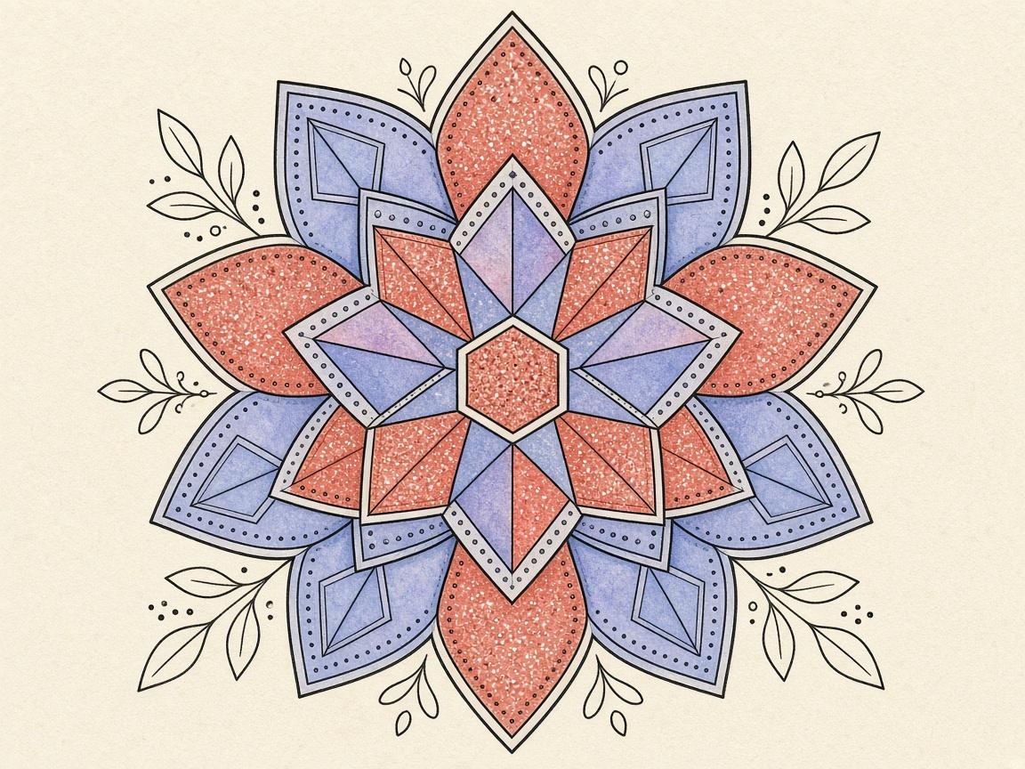
To color with neon and glitter effects in ColorDood, pick the Neon or Glitter tool from the tool dock and use it on a few areas where you want extra punch. Neon paints a layered glow, and Glitter adds colored flecks. Both look best as accents, not as the only color on a page.
This guide explains how each effect behaves, where to use them for outlines and highlights, which palettes to try, and how to keep a page readable. It also covers when to skip the effects altogether. It is a practical guide to the app’s tools, and it makes no claims about mood, health, or learning.
How Neon behaves
Neon paints a layered glow. Each pass adds a soft halo around the stroke, so the line looks brighter than a standard solid stroke. Where you overlap strokes, the glow builds up and can become very bright. That makes Neon striking, but it also means a little goes a long way.
Neon works best for outlines, borders, and shapes you want to stand out, such as the edge of a leaf, the rim of a bowl, or a border around a mandala. Use a medium brush size for lines, and avoid very large sizes on big areas, where the glow can overwhelm the shape.
A practical way to start is to outline one shape in Neon, then look at the page at normal size. If the outline reads clearly without hiding the details inside it, you have the right balance. If the glow fills the shape and hides the lines around it, undo the last few strokes and try a smaller brush or a lighter touch.
How Glitter behaves
Glitter adds colored flecks to the stroke. The flecks are scattered rather than solid, so the result looks sparkly and textured. It is a good match for small highlights, such as the tip of a petal, the center of a flower, or a few points on a fruit.
Glitter can cover a page quickly, and a dense sprinkle can make the shapes hard to read. Keep the strokes light and short. If the flecks start to blur a shape you want to keep clear, undo the last few strokes.
A useful test is to add glitter to a single small area first, such as the center of one flower. Zoom out and look at it from a normal viewing distance. If the highlight stands out without crowding its neighbors, you can repeat the same light touch in a few other places. Many pages look best with only a handful of sparkles in total.
Where to use bold effects
A good approach is to choose one or two areas per page for the bold effect. Keep the rest of the page in solid colors, a gradient, or a soft tool. The contrast between plain and bright areas makes the effect feel deliberate instead of crowded.
- Neon: outlines, borders, and edges you want to highlight
- Glitter: small highlights, sparkles, and tips of shapes
- Plain tools: large background areas and anything that needs a calm base
- Gradient or Rainbow: a single area where you want movement without extra effects
Gradient and Rainbow paint are separate from the Neon and Glitter tools. You can combine them with a plain stroke for a richer result, but keep the number of effects on a page small.
Palettes to try with bold effects
ColorDood has ten palette styles. Neon and Space are good starting points for bright, high-contrast effects. Neon gives you vivid colors that suit glow, and Space offers deep tones that make bright strokes stand out. Jewel is another option when you want rich, saturated colors with a little more depth.
Change palettes with the Palette button in the tool dock, or from Settings > Change palette. Each palette has solid swatches, lights and darks rows, eight gradients, and a rainbow swatch. Because results depend on the page and your screen, test a palette on a small area before you commit to a whole page.
Keeping a page readable
A page is readable when the important shapes still stand out. Bold effects can blur edges and hide the lines you want to see. Two habits help. First, color the big plain areas before you add any neon or glitter. Second, zoom out often to check how the page reads at a normal size.
If a neon line blends into a neighboring shape, reduce the brush size or turn the boundary to Inside. Inside clips your strokes to the enclosed shape where your touch starts, which keeps the glow where you meant it to be.
Undo and redo go back up to 12 steps, and they sit in the canvas header. Use them to remove a heavy effect and try a lighter one.
Save a copy before you try something bold on a page you care about. The gallery keeps your work when you leave the canvas, and you can tap a gallery item to continue from there. That gives you a safe way to experiment with effects you are not yet sure about.
When to skip the effects
Not every page needs neon or glitter. Skip the effects when a page has very small areas, when you want a quiet session, or when you are testing the basics of a new page. A plain stroke with a calm palette is often the better choice for a relaxed evening.
Skip the effects if you find them distracting. Many colorers prefer soft, plain color for long sessions, and that is a perfectly good way to use the app. The effects are options, not requirements.
A checklist for bold effects
- Choose a page with clear shapes and enough open space
- Color the large background areas with a plain tool first
- Pick Neon for one or two outlines or borders
- Use Glitter in small, sparse spots only
- Test your palette, such as Neon or Space, on a small area
- Zoom out and check that the main shapes still read clearly
- Undo any effect that hides a shape you want to keep
- Save your work by leaving the canvas, so the gallery keeps it
What this guide does not cover
This guide does not cover every blend mode, brush setting, or palette swatch in detail. It also does not compare ColorDood with other apps or claim that any effect is better than another. For the latest tool behavior, check the app itself, since details can change with updates.
Bold effects are a creative choice. This guide makes no claims about mood, wellbeing, or learning, and it does not promise any particular result. Coloring is a hobby, and you can enjoy it in whatever style you like.
Frequently asked questions
What does the Neon tool do in ColorDood?
It paints a layered glow around the stroke, so the color looks bright and luminous. It works well for outlines and accents, and it can look heavy if you cover a whole page with it.
What does the Glitter tool do?
It adds colored flecks to the stroke. Glitter is best used sparingly, such as for small highlights, because a lot of it can make a page look busy.
Which palettes work well with neon and glitter?
Neon and Space are good starting points for bright, high-contrast effects. Jewel is another option for richer tones. Test any palette on a small area first, since results depend on the page.
How do I keep a page readable with bold effects?
Use bold effects on a few areas only, keep the rest of the page in plain colors, and zoom out often to check the balance. Undo any stroke that hides a shape you want to keep visible.
Ready to play a free coloring game?
Download ColorDood — free AI adult coloring book and coloring game with 1000+ pages, 11 tools, calming sounds, and no login required.