Product guide
ColorDood Palettes: All 10 Styles and How to Pick One
ColorDood has 10 palette styles, each with solid swatches, lighter and darker rows, named gradients, and a rainbow swatch. Here is how to choose one and plan colors for a page.
Updated November 14, 2026 · 8 min read
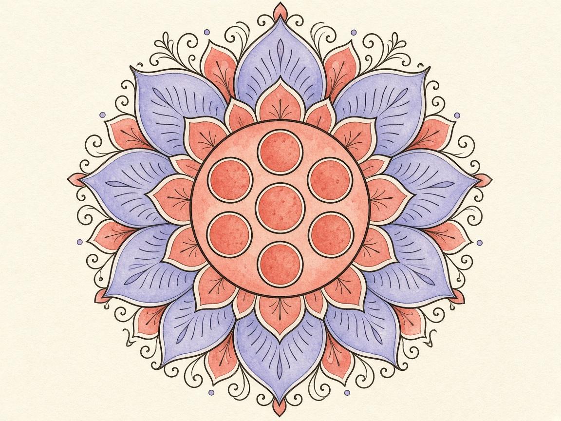
**ColorDood has 10 palette styles.** They range from soft Pastel and warm Sunset to bright Neon and deep Space. Each one gives you a set of colors to work with. Picking a palette before you start can make a page feel more finished, and it can save a lot of decision making mid-page.
ColorDood is a free coloring app for iOS and Android. This guide walks through all 10 styles, explains the swatches and gradients inside each one, and shows how to plan a palette for a page. The mood notes below come from the palette names only. They are suggestions to try, not rules.
The 10 palette styles
**Vibrant** is a good first choice if you want bold, clear color. It suits pages with simple, bright shapes and a cheerful finish.
**Pastel** suggests soft, light color. Try it for a calm page, a loose background, or a finish that feels gentle.
**Earthy** suggests browns, greens, and warm neutrals. It can suit plants, wood, and home scenes that feel grounded.
**Neon** suggests high-energy, bright tones. It works well with the Neon paint tool for a glowing look.
**Jewel** suggests deep, rich color. Try it for patterns and mandalas where you want the page to feel dense and saturated.
**Ocean** suggests blues and sea tones. It can suit water, sky, and calm, open designs.
**Candy** suggests sweet, playful color. It can fit fruit, treats, and bright everyday objects.
**Sunset** suggests warm oranges, pinks, and golds. It can suit landscapes and evening-feeling scenes.
**Forest** suggests greens and natural shades. It can suit leaves, trees, and garden pages.
**Space** suggests dark, cool tones with a night-sky feel. It can suit patterns that look good on a dark base.
What is inside each palette
Each palette has about 40 solid swatches. They are arranged in lights and darks rows, so you can move from a light tint to a deep shade without leaving the set. This is useful for shading. Pick a base color, then use a lighter or darker swatch for highlights and shadows.
Each palette also has 8 named gradients and a rainbow swatch. Gradients blend across a shape, and the rainbow swatch goes with the Rainbow paint type. Gradient and rainbow paint are covered in their own guide, but it helps to know they live inside the same palette.
How to change a palette
There are two ways to switch. On the canvas, tap the Palette button in the tool dock. You can also open Settings and choose Change palette. Both routes lead to the same list of 10 styles.
Switching palettes does not erase your work. It only changes the swatches you can pick from. Your painted areas stay as they are.
Planning a palette for a page
Start by looking at the page. Count the big shapes and the small details. A page with a few large areas can use a bold palette with strong contrast. A page with many small details may look better with a more limited set of related colors.
Next, pick two or three main colors before you start. Choose one for the largest area, one for a secondary area, and one for accents. Keep the rest of the palette as backup. This simple plan keeps the page from becoming a patchwork of unrelated colors.
Last, decide how much shading you want. If you plan to shade, check the lights and darks rows in the palette before you start. Having a lighter and darker option ready for each main color makes shading faster.
Using a custom color
Sometimes a palette does not have the exact shade you want. The color wheel in the tool dock lets you pick a custom color. Use it when you have a specific color in mind, such as a particular blue for a sky or a shade that matches a photo of a flower.
A custom color works alongside the palette. You can switch between the wheel and the swatches as you go, so there is no need to choose one approach for the whole page.
Palette ideas by type of page
For a mandala or a geometric pattern, many people like a Jewel or Space palette. Deep colors can make repeated shapes stand out. For a flower or garden page, Pastel, Sunset, or Candy may feel more natural. For a vehicle, Neon or Vibrant can make the page feel energetic. For a home or kitchen scene, Earthy often feels calm and familiar.
These are suggestions, not rules. Your taste matters more than any list. The best way to decide is to try two palettes on the same page, look at both results, and keep the one that you enjoy more. Switching is quick, so there is little cost to testing.
Making a palette work across a whole page
A page can look unified when you repeat a color. Pick one accent color and use it in two or three places across the page. This ties the design together, even when the other areas use different shades. Lights and darks rows make this easier because you can reuse the same family of colors.
Testing a palette before you commit
Before you start a large page, test a palette on a small area. Fill one shape, look at it next to the page background, and check whether it still reads well. Then try a shading swatch next to it. If the pair looks muddy or too similar, try another palette. This takes less than a minute and can save a lot of undoing later.
Remember that the screen can look different from paper. If you plan to print a finished page, export it and look at the file before you commit to a final palette. Colors on a phone are not always the same as colors on paper.
A short checklist
- Open a page and look at its big shapes and small details.
- Pick a palette from the Palette button or Settings.
- Choose two or three main colors before you start.
- Check the lights and darks rows for shading.
- Try a gradient on one large area.
- Use the color wheel only when the palette lacks a shade you need.
- Switch palettes if the page feels off, without losing your work.
What this does not cover
This guide does not describe the exact hex value of every swatch, and it does not promise that one palette will suit every page. The mood notes are suggestions drawn from the palette names. Test a palette on a real page to see how it feels to you.
Color choices are a matter of taste. Coloring is a pastime, not medical advice, and nothing here is a recommendation for any health or wellness goal.
Frequently asked questions
How many palettes does ColorDood have?
There are 10 palette styles: Vibrant, Pastel, Earthy, Neon, Jewel, Ocean, Candy, Sunset, Forest, and Space. Each one has its own set of swatches and gradients.
How do I change the palette?
Tap the Palette button in the tool dock on the canvas, or open Settings and choose Change palette. Pick any of the 10 styles from the list.
What is the rainbow swatch?
Each palette includes a rainbow swatch. It pairs with the Rainbow paint type, which shifts hue along a stroke as you paint. You can use it with the Brush.
Can I use a color that is not in the palette?
Yes. The color wheel in the tool dock lets you pick a custom color outside the palette.
Ready to play a free coloring game?
Download ColorDood — free AI adult coloring book and coloring game with 1000+ pages, 11 tools, calming sounds, and no login required.